


Between 11 and 13 October 2026, WeavyAudio got a new look. WeavyAudio offers background music for venues, and our team at Breeze Professional IT Services designed, built, hosts and maintains it. Parts 1 to 4 of this series tour the features. This part is a before and after look at ten pages, each shown in the old design and in the new one. It is written for venue owners, and for companies that are thinking about their own music streaming platform.
Here is what did not change: the catalog, the license, the price and the page addresses. What changed is how the pages look and how you move through them. It was a website redesign and a web app redesign in one. Both versions use a dark theme with amber buttons, but the new one is warmer: black and brown, brushed metal, wood and gold. The app is built with Next.js. We describe only what you can see on the screens.
The Home Page: The Real App Replaces a Glowing Shape
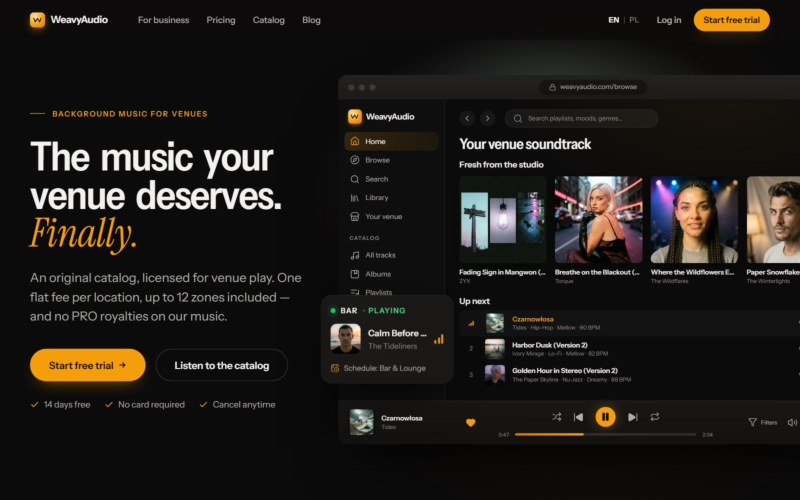
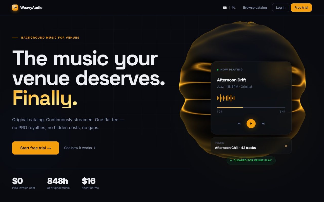
The headline did not change: "The music your venue deserves. Finally." The rest of the first screen did. Before, a glowing amber shape held a "Now playing" card, and three figures sat under the buttons: $0 PRO invoice cost, 848h of original music and $16 per location per month.
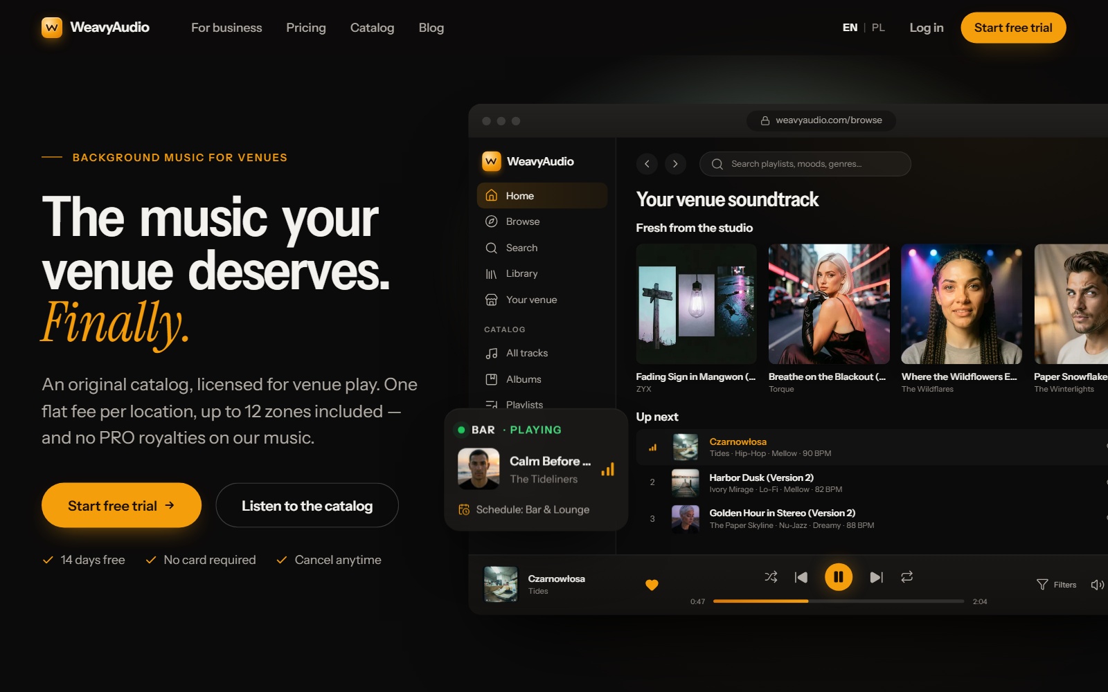
Now the right side shows a browser window with the real app: the sidebar, "Your venue soundtrack", fresh covers, an "Up next" list, the player bar and a small card, "Bar · Playing". The top bar offers For business, Pricing, Catalog and Blog. Three ticks sit under the buttons: 14 days free, No card required and Cancel anytime.
The offer line says: "An original catalog, licensed for venue play. One flat fee per location, up to 12 zones included — and no PRO royalties on our music." The price is still $16 per location per month.
The App Home: A Turntable That Shows Your Day
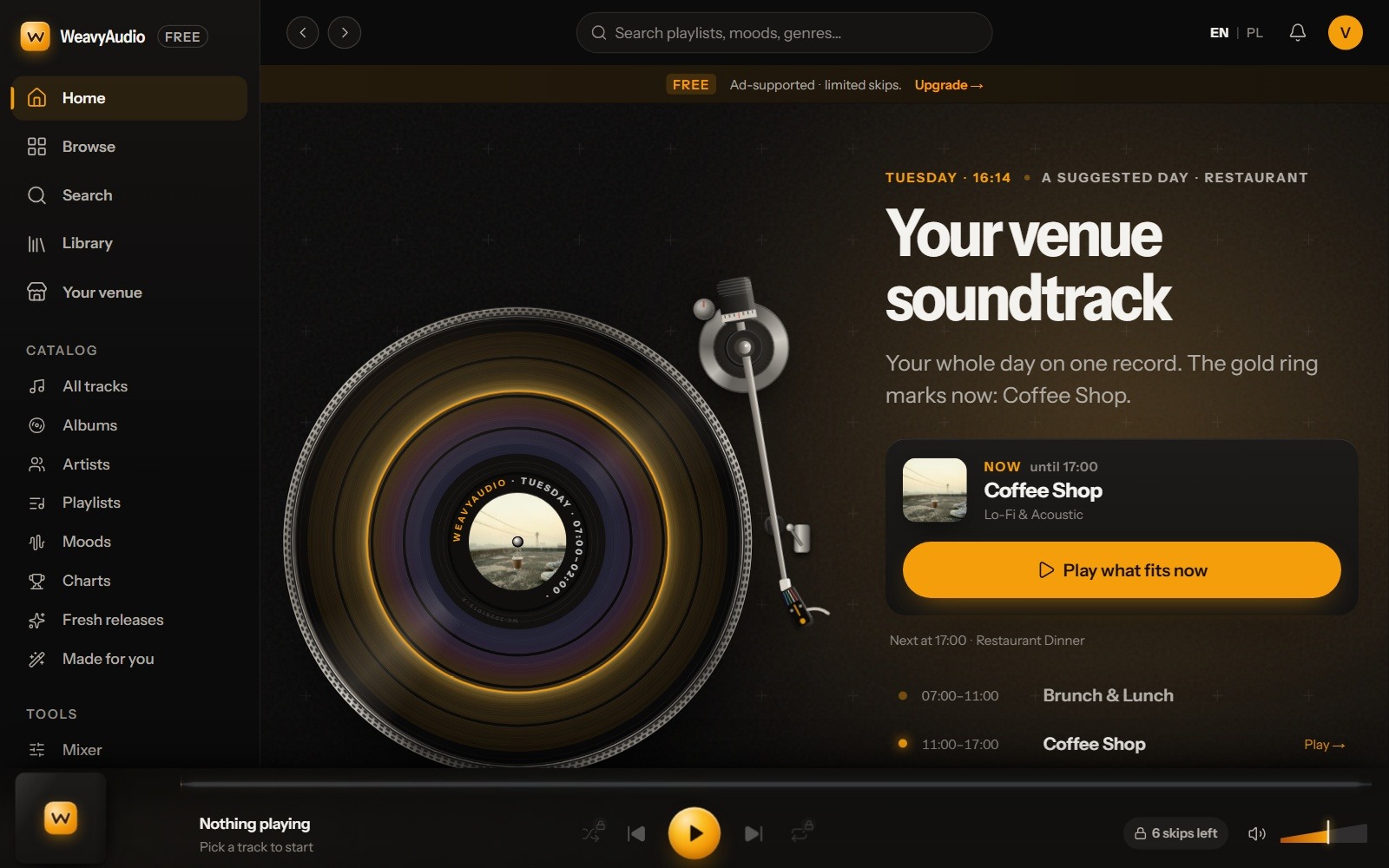
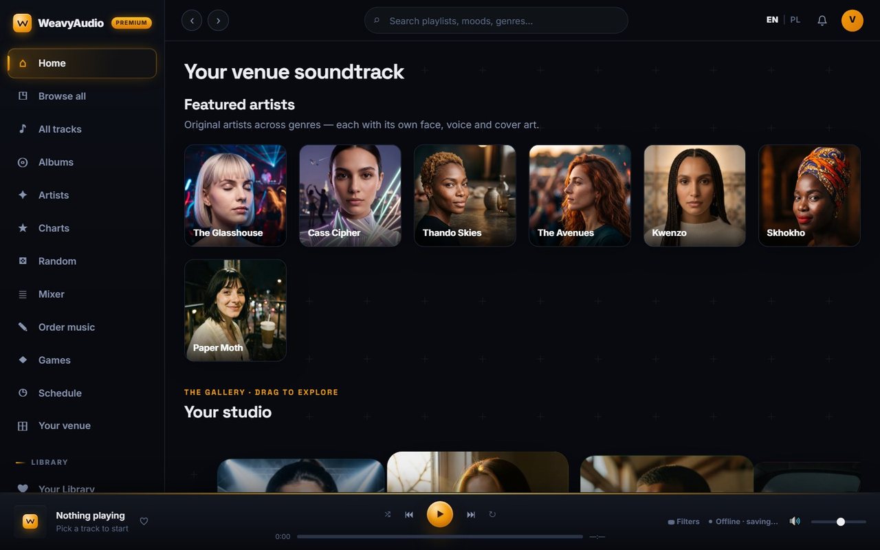
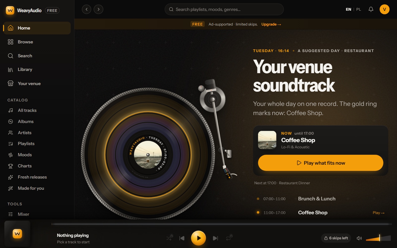
The old app home was a page of portrait cards: "Featured artists", then a "Your studio" gallery. The new one opens with a turntable. The record shows a whole venue day on one disc, and a gold ring marks now. In the screenshot it is Tuesday, 16:14, and the card says Coffee Shop, Lo-Fi & Acoustic, until 17:00. One big amber button says "Play what fits now". Under it: "Next at 17:00 · Restaurant Dinner".
The day is a suggestion for a restaurant. Further down, the page also offers café, bar, shop, gym, salon, spa and hotel lobby, and the "Your studio" gallery is still there. In UX design terms, the app home now answers one question first: what should play right now?
The sidebar changed too: five main links, a Catalog group and a Tools group. The new screenshots come from a free guest account, the old ones from a Premium account, so the FREE band and "6 skips left" belong to the account, not to the design.
Browse All: A Stereo Receiver With a Tuning Knob
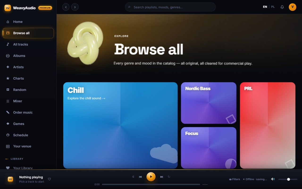
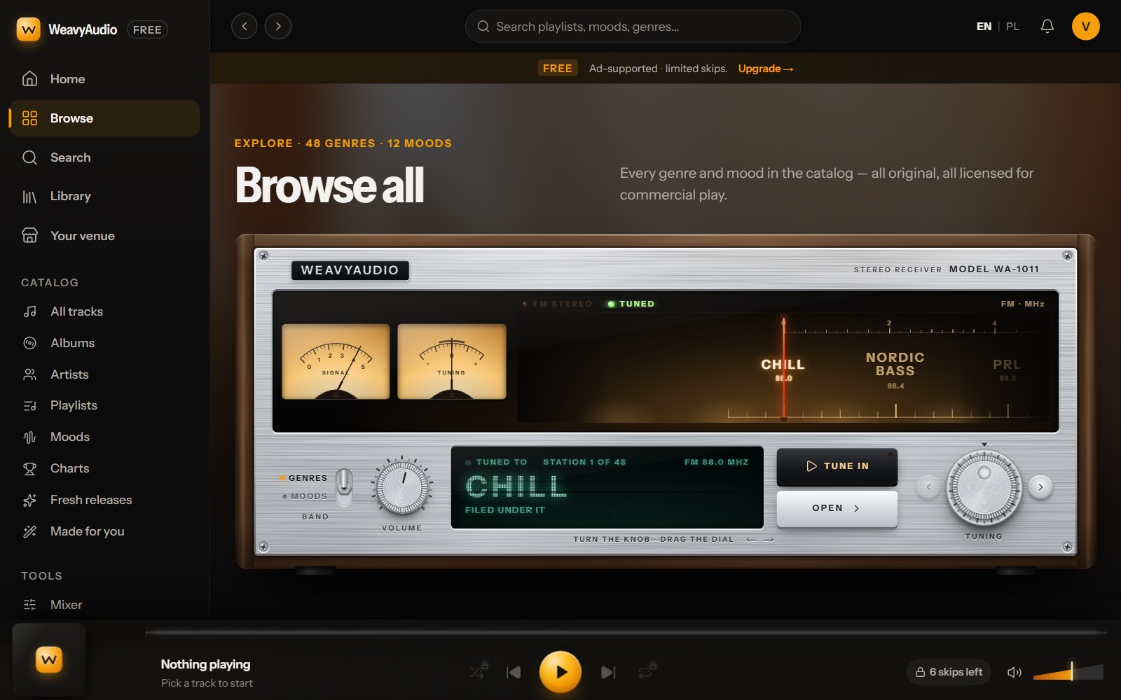
The old Browse all page was a grid of big color tiles (Chill, Nordic Bass, Focus, PRL) under a 3D knot. The new page is a stereo receiver, model WA-1011, with two needle meters, a dial strip, a green display and a tuning knob. Each genre has a place on the dial, from 88.0 to 108.0. These are positions, not real radio frequencies. The display reads "Station 1 of 48".
You turn the knob, drag the dial or use the arrow keys. "Tune in" plays the genre and "Open" goes to its page. A Genres and Moods switch changes the band. The genre names are still plain text on the page, with links like "Explore the chill sound". Tip: you do not have to learn the dial. Press "Tune in" and listen.
Moods: From Color Tiles to a Mood Pad
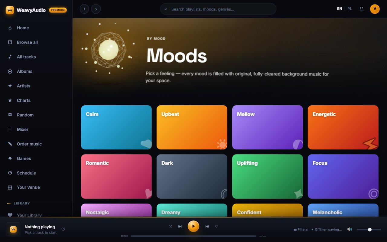
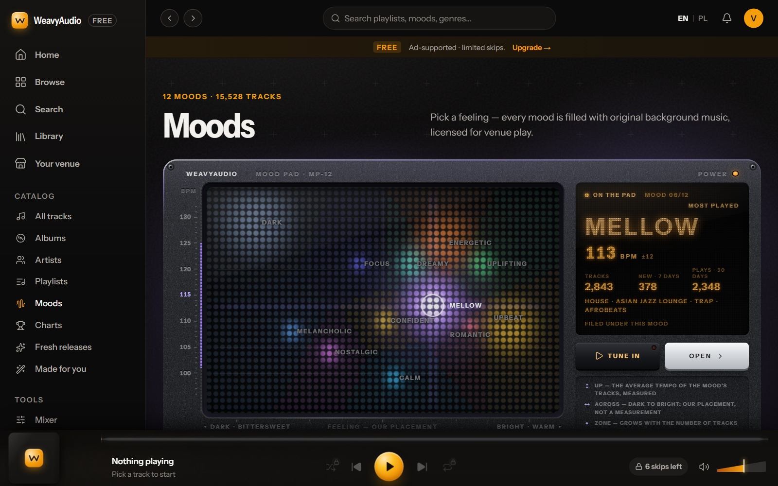
The old Moods page was twelve color tiles. The new page has the same twelve moods on a mood pad of glowing dots. The side axis is tempo, from 100 to 130 BPM. The bottom axis runs from dark and bittersweet to bright and warm. The legend is honest: up is "the average tempo of the mood's tracks, measured", and across is "our placement, not a measurement".
In the screenshot, Mellow is selected: 113 BPM, 2,843 tracks, 378 new in 7 days, filed under House, Asian Jazz Lounge, Trap and Afrobeats. The header counts "12 moods · 15,528 tracks". Tip: to slow the room down, pick a mood lower on the pad and press "Tune in".
Search: A Panel That Shows Where Results Land
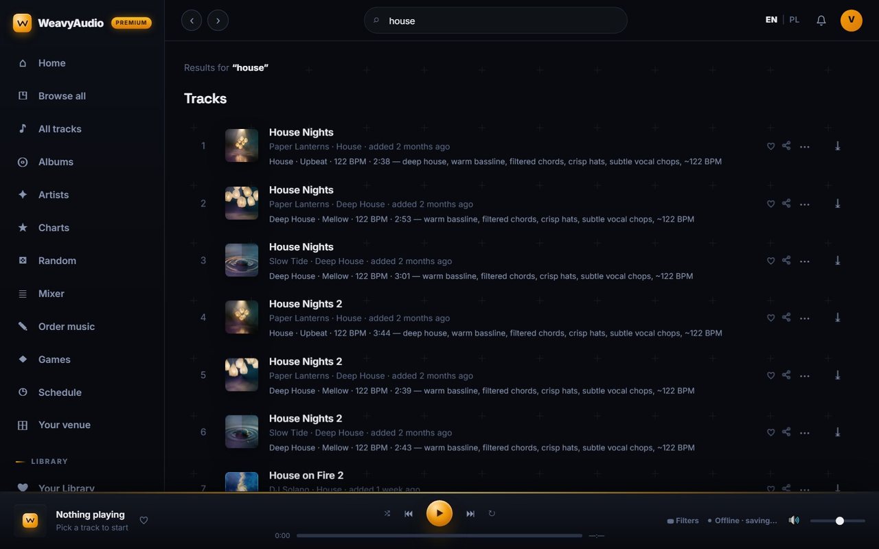
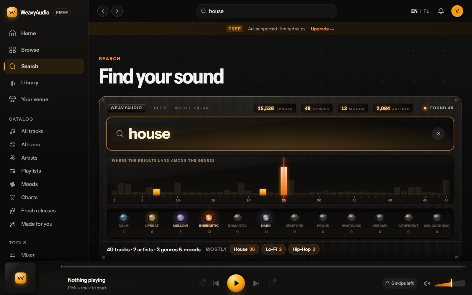
The old search for "house" was a plain list: cover, title, artist, genre, age, BPM, a short description, and icons to like, share and download. The new page starts with "Find your sound" and a panel called Seek, model SK-48. It shows the size of the catalog: 15,528 tracks, 48 genres, 12 moods and 2,084 artists.
Under the search box, a strip has one bar for each of the 48 genres. For "house", one tall bar rises near 25 and two small ones light up. Round buttons count the results by mood: Energetic 13, Dark 11, Mellow 8, Upbeat 6, Calm 2. The summary reads "40 tracks · 2 artists · 3 genres & moods", mostly House 36, Lo-Fi 2 and Hip-Hop 2. The screenshot ends before the result rows, so the panel comes first. Tip: try a mood word, not only a genre.
Your Library: A Wall of Records
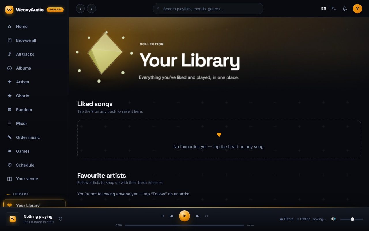
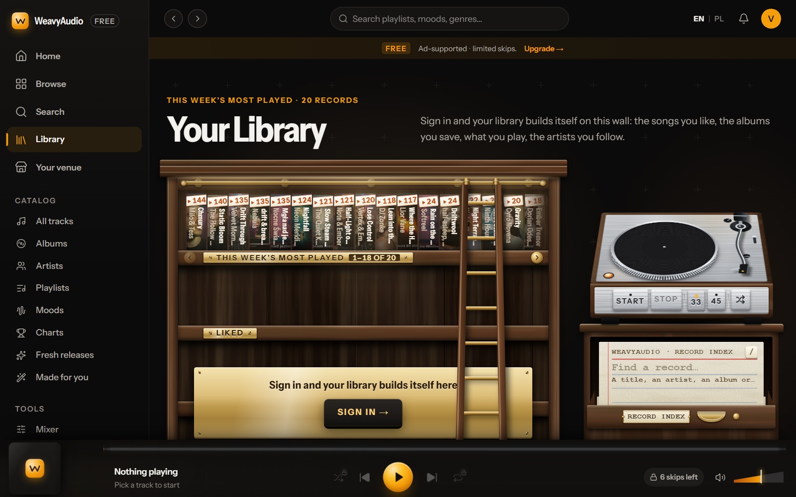
The old Your Library page was plain: a crystal icon and empty sections for liked songs, favourite artists and recently played tracks. The new page is a wooden shelf wall with a ladder. Each record has a spine with a title, an artist and a number. The top shelf is "This week's most played", with 20 records. A second shelf is called "Liked".
On the right are a small turntable (Start, Stop, 33, 45, shuffle) and a "Record index" card for searching by title, artist, album or genre. A brass plaque says "Sign in and your library builds itself here". The page also explains the keyboard: tab to a shelf, move with the arrow keys, press Enter to pull out a record. Tip: press / to jump to search.
The Track Page: The Cover Fills the Screen
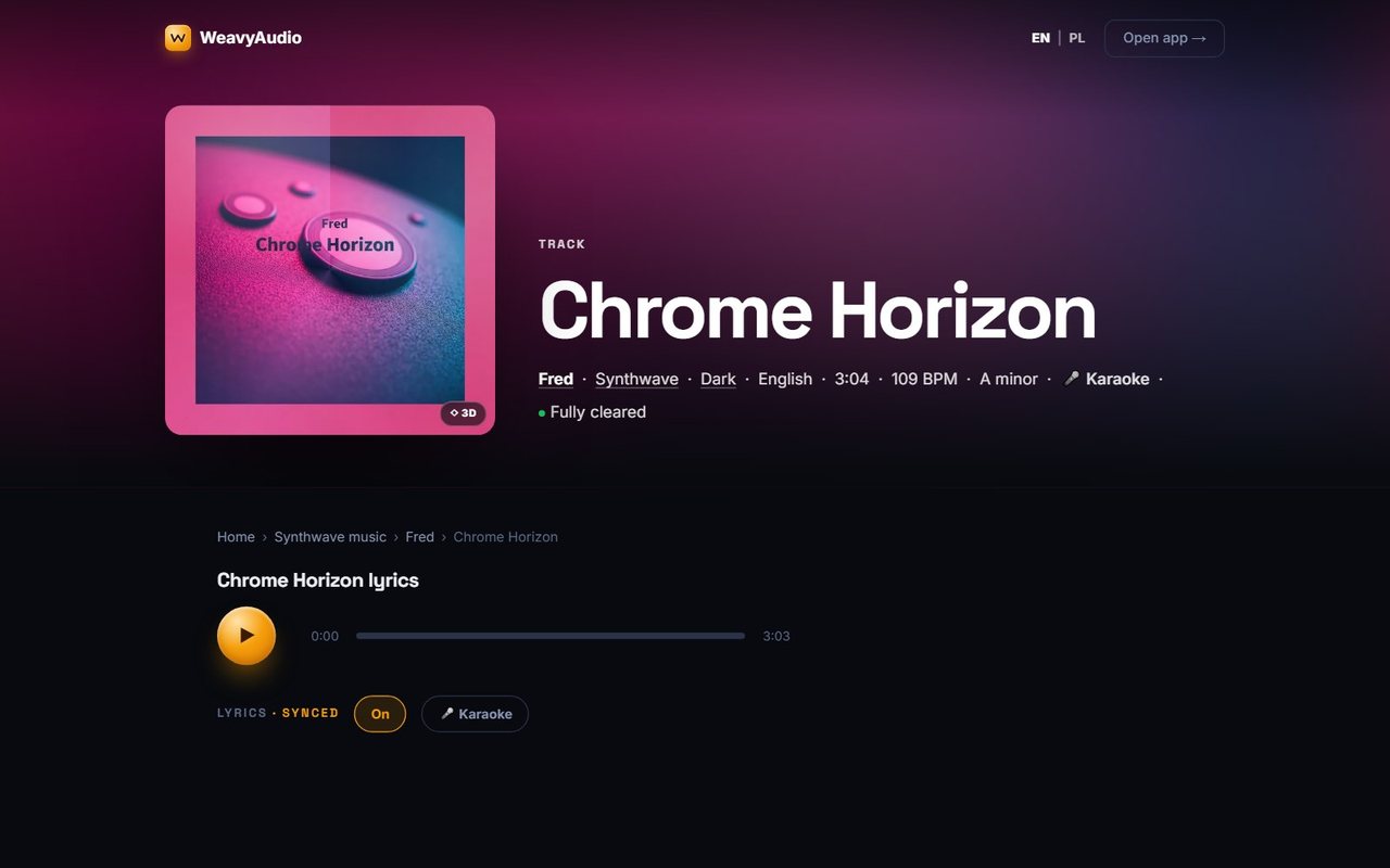
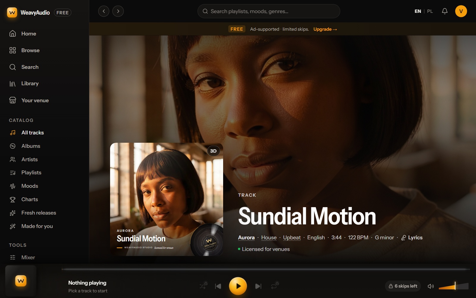
The old track page stood on its own: a small header with "Open app", a pink gradient, a square cover with a 3D badge and a line of facts. The new track page opens inside the app, with the sidebar and the player around it. The cover is now a huge background, and the same cover sits in front as a card with a 3D badge and a vinyl disc at its corner. The facts line is still there: artist, genre and mood as links, then English, 3:44, 122 BPM, G minor, Lyrics and a green "Licensed for venues". The two screenshots show different songs.
The page text shows lyrics that follow the audio, with an On switch and a Karaoke button, plus "Versions of this song" and "Similar upbeat house tracks". The footer says the music is owned by WeavyAudio and licensed to subscribers for public performance at their registered locations, in line with "no PRO royalties on our music". Live music, DJ sets and TV with sound can need separate licenses. The calculator page explains this.
The Mixer: Same Controls, a Warmer Look
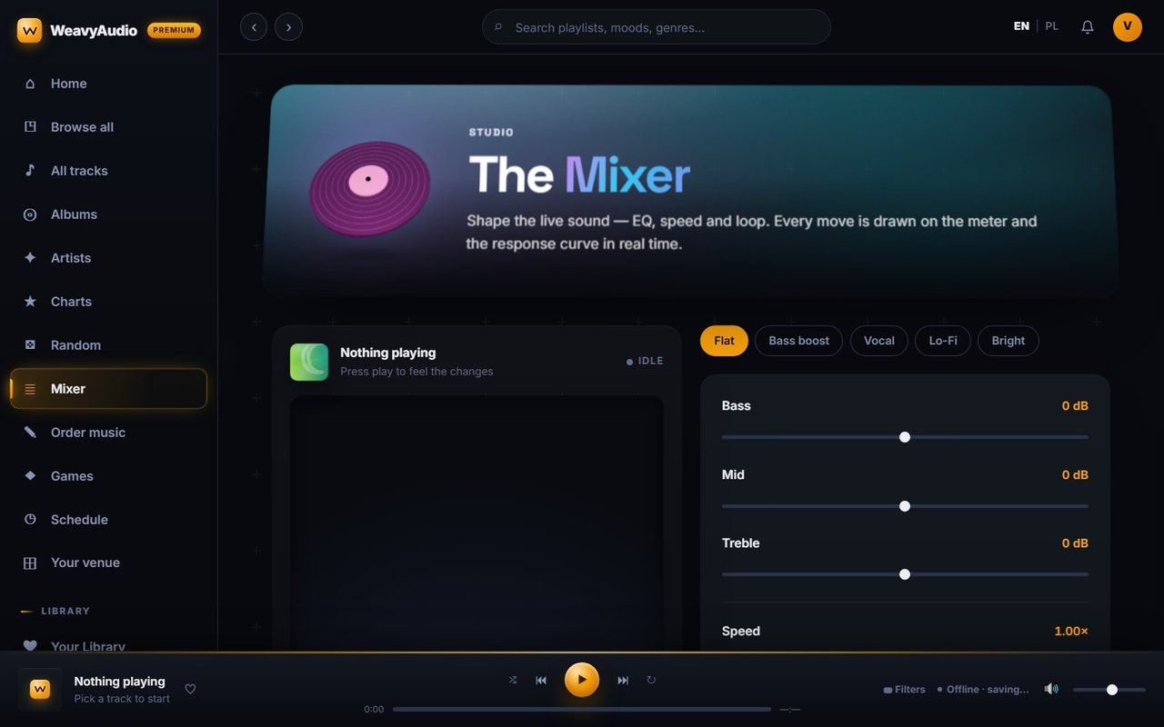
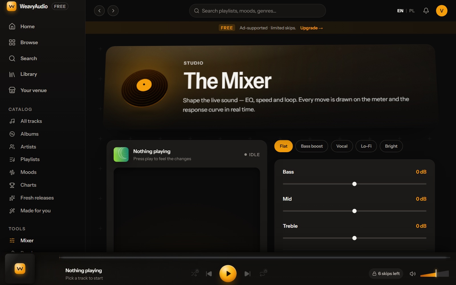
The mixer changed least. Both versions say "The Mixer" and "Shape the live sound — EQ, speed and loop." The presets are the same: Flat, Bass boost, Vocal, Lo-Fi and Bright. So are the Bass, Mid and Treble sliders at 0 dB, the speed control, the A–B loop and "Reset to flat".
The style changed: a teal hero with a pink record became a warm brown and amber panel with a dark record and a white title. The mixer now sits in the Tools group, with Random, Games, Order music and Schedule. The stem fader text was rewritten too: "This track has no separate instrument stems yet. Once we add them, a fader for each instrument will appear here." Tip: use the A–B loop to repeat one part on your own speakers.
The Music Schedule: Templates Instead of an Empty Page
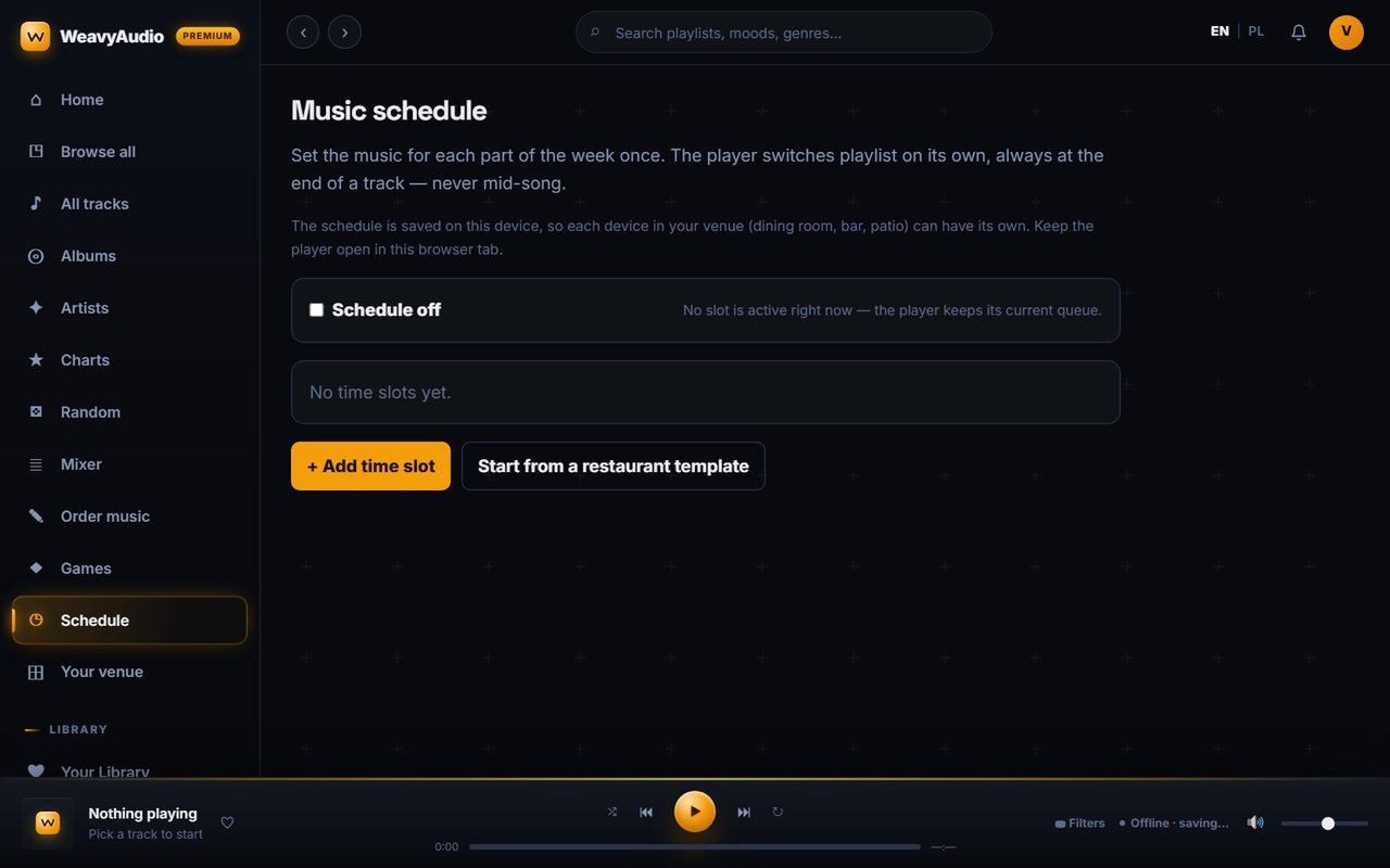
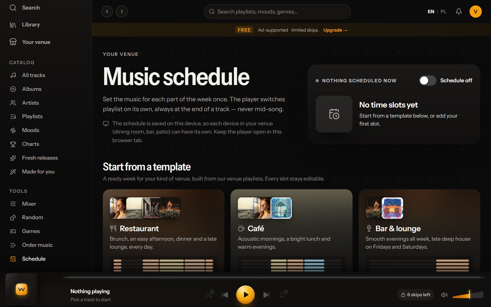
The music schedule is where the redesign helps a venue most. The old page was a form: a "Schedule off" checkbox, "No time slots yet" and two buttons, one of them "Start from a restaurant template". The rules did not change. The player switches playlist at the end of a track, never mid-song, and the schedule is saved on the device, so the dining room, the bar and the patio can each have their own.
The new page has a status panel with a switch and a section "Start from a template". The screenshot shows Restaurant, Café and Bar & lounge cards with covers and a small timeline. The page text adds Shop & boutique, Gym, Hair & beauty salon, Spa & wellness and Hotel lobby. The Restaurant card runs brunch from 07:00, a coffee shop slot from 11:00, dinner from 17:00 and a lounge from 22:00 to 02:00. Every slot stays editable. Tip: pick the closest template, then edit it.
On a Phone: Wider Buttons, a Shorter Headline
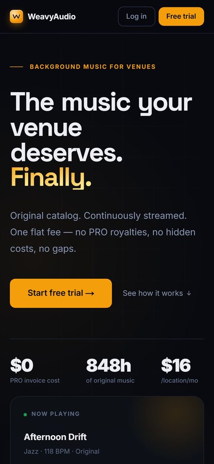
Before, the phone view of the home page had "Log in" and "Free trial" buttons in the top bar, a four-line headline, "See how it works" beside the main button, then the $0, 848h and $16 figures and a "Now playing" card.
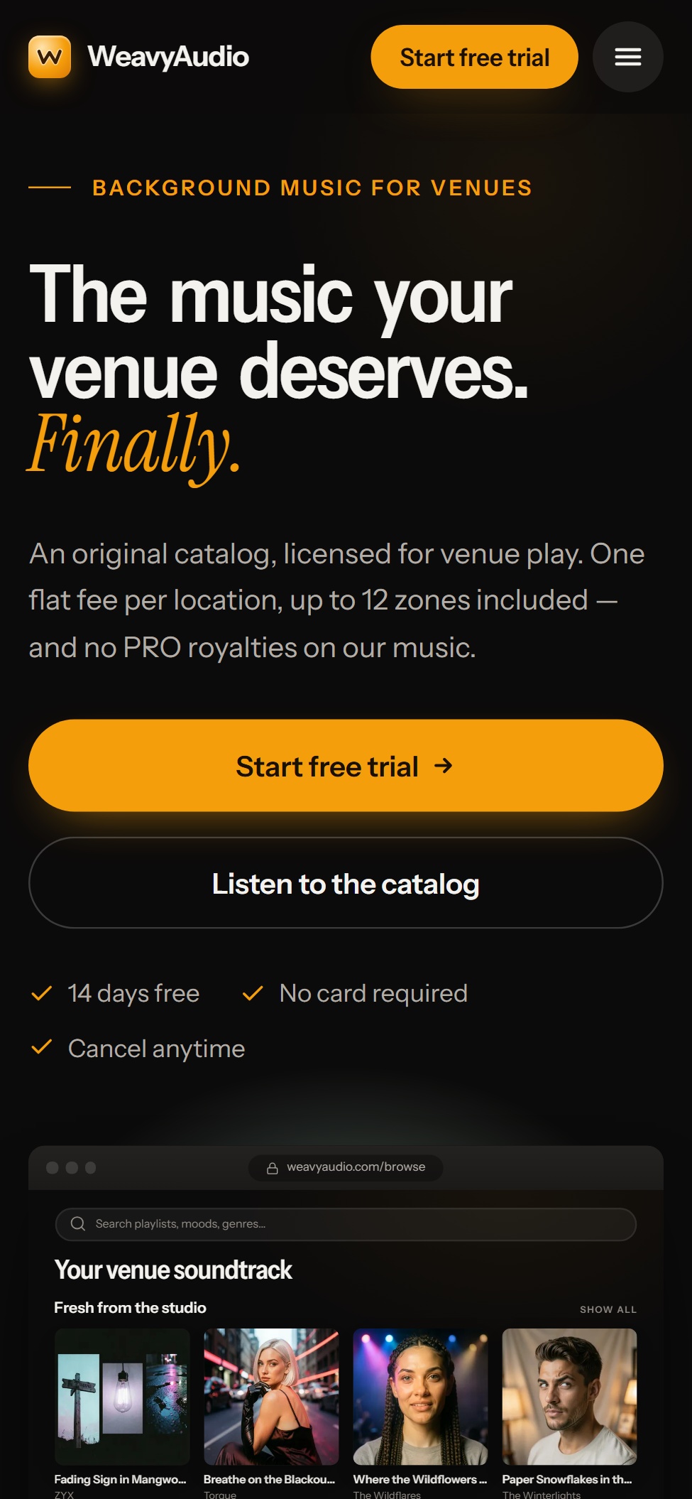
Now the top bar holds the logo, "Start free trial" and a menu button. The headline takes three lines. "Start free trial" and "Listen to the catalog" are two wide buttons, one above the other, easy to hit with a thumb. The three ticks wrap onto two lines, and a small browser window shows the app below them. Everything fits the screen width, so the page stays mobile-friendly. Tip: open the site on your own phone.
That is the new look, page by page. The catalog, the license, the price and the page addresses are the same. The dark theme stayed, and many pages are now built around one object: a turntable, a receiver, a mood pad, a record shelf. Parts 1 to 4 describe the new design too, so go there for artists, albums, playlists, licensing and Weavy Studio.
Planning a website redesign, or a custom web platform for your own business? Breeze Professional IT Services can design, build, host and maintain it. Contact us to talk about your project.
This project was designed, built and is hosted by our team. See the overview in Our Newest Project: WeavyAudio, the WeavyAudio project page and our other projects, or contact us about your own platform.
WeavyAudio feature series
- Part 1: WeavyAudio Case Study, Part 1: Catalog and Music Discovery in the New Design
- Part 2: WeavyAudio Case Study, Part 2: Artists, Albums and Tracks in the New Design
- Part 3: WeavyAudio Case Study, Part 3: Music Tools for Venues in the New 2026 Design
- Part 4: WeavyAudio Case Study, Part 4: Pricing, Licensing and Weavy Studio in the New Design
- Part 5: WeavyAudio Case Study, Part 5: The New Design, Before and After (you are here)