



Shoppers who do not land directly on a product page almost always pass through a category page or a search results page first. That is where a store either helps them narrow hundreds of products down to a handful, or loses them to the back button. Product listing page design gets less attention than the homepage or checkout, yet it decides whether visitors ever reach a product. Here is what to get right: filters, product cards, sorting and the store's own search.
What product listing page design has to achieve
Good category page UX helps a visitor do four things in quick succession:
- Orient: see which category they are in, how many products it holds and what the range covers.
- Narrow: cut the list down by the attributes they care about.
- Compare: scan the remaining products without opening each one.
- Move on: open a product, or come back to the list without losing their place.
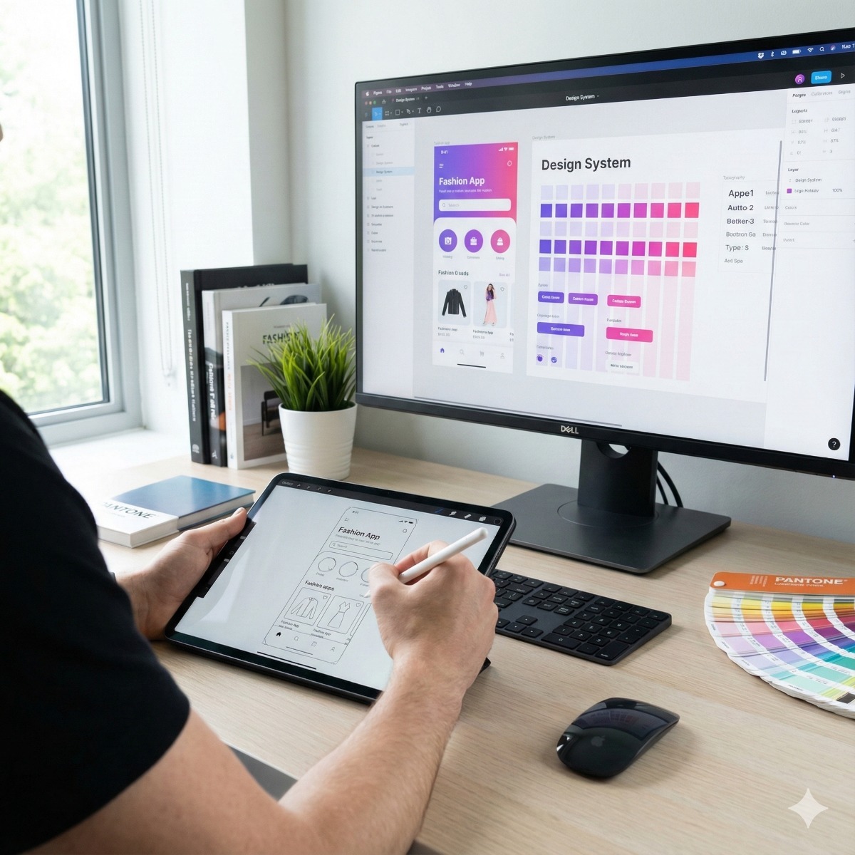
A short introduction and links to subcategories help with the first step; the rest depends on filters and product cards. Category pages are one of the templates we prototype in Figma as part of e-commerce UX design work, together with product pages and checkout.
Ecommerce filter UX that helps instead of hides
Most filter problems start with the data, not the design. Filters can only be as good as the product attributes behind them, so the first question is which attributes shoppers actually use to choose: size and fit for clothing, compatibility for parts, dimensions for furniture, power for tools. The terms people type into your store's search box and the questions your sales staff hear are the best sources.
- Show counts next to each filter value, and hide or disable values that would return nothing.
- Show applied filters above the results as chips that can be removed one by one, with a single "clear all".
- Use customers' words: "Fits 2018 to 2023 models" rather than an internal code.
- Order filters by usefulness, not alphabetically, and keep the list short where only a few attributes matter.
- Keep the page stable. Updating results without a reload is fine, as long as the page does not jump and the chosen filters survive the back button.
When attributes are inconsistent across thousands of products, the fix belongs in the product data itself, and our ERP and PIM integration service deals with that side.
Mobile filters
On a phone, mobile filters work best in a full-screen panel opened from a sticky "Filter" button placed next to "Sort". Let people select several values and apply them together with a button that shows how many products will remain. After applying, take them back to the top of the results and keep the applied filters visible above the list.
Product card design
Each card has to answer "is this worth opening?" in a second or two. Useful product card design includes:
- Images at a consistent ratio and on a consistent background, so the eye compares products rather than photos.
- A name that includes the distinguishing detail, such as model, size or capacity, not just the product line.
- The price, with sale prices shown clearly and honestly.
- One or two deciding facts: color swatches, sizes in stock or delivery time.
- Ratings only where they come from real reviews.
Leave out what belongs on the product page. A card crowded with badges and buttons slows scanning, and on mobile every extra line pushes the next product off the screen.
Sort options, pagination vs infinite scroll
Offer sort options that match how people shop the category: relevance or best-selling as the default, price in both directions, newest for fashion and technology, and rating where reviews are plentiful. Remember the choice while the visitor browses.
The debate over pagination vs infinite scroll has a practical answer for most stores: a "load more" button. Infinite scroll makes the footer unreachable and makes it hard to return to the same spot after opening a product, while classic pagination adds taps on mobile. A load-more button keeps people in control, and each loaded block should still have its own crawlable page URL so search engines can reach every product.
Ecommerce site search and the no results page
Visitors who use search usually know what they want, so ecommerce site search deserves as much care as the menu. It should tolerate typos and plurals, understand synonyms such as "couch" and "sofa", find products by SKU and model number, and suggest products and categories while the visitor types. Review the search log every month: terms that return nothing are a ready-made list of missing products, missing synonyms and missing attributes.
A no results page should never be a dead end. Offer a spelling correction, popular categories, a few best-sellers and a way to ask a person. Someone who searched is someone with intent, and a helpful no results page keeps at least some of them.
Frequently asked questions: product listing page design
How many filters should a category page have?
As many as shoppers actually use to decide, and no more. Order them by importance, and move rarely used filters behind a "more filters" link rather than removing them.
Should out-of-stock products appear in listings?
Usually yes, but lower in the list and clearly marked, with an option to hide them. Removing them entirely breaks links and hides products that will soon be back.
How do we know if listing page changes worked?
Track filter usage, searches that end without a click, and how many listing visits lead to a product page. For larger changes an A/B test gives a cleaner answer, which our conversion rate optimization service covers.
Do shoppers get lost between your menu and your products? Our e-commerce UX and UI design service starts with a user experience audit, then moves to Figma prototypes of category pages, filters, product pages and checkout for WooCommerce, Magento and PrestaShop stores. Send us your store address and your best-selling categories, and we can suggest where to start.